

By Terry O’Toole
Your logo’s primary role is to identify your brand, business, or service to your intended audience. Logos are the face of your company, and to ensure viewers stop and take notice, they have to be eye-catching, unique and memorable.
Your logo can achieve this by visually communicating your brand’s unique identity using logotype, color, font, your name, and, if used, a slogan.
However, you can also find inspiration by using influences that are in some way connected to your market and service. It’s an intelligent approach that helps you stand out from your competitors and is an excellent way of grabbing the viewer’s attention by making them think a little harder about your logo.
The result being, your logo becomes engrained in their memory.
To find ways of making yours a little more special and memorable, get inspired with these logo examples from different industries.
Restaurant Logos
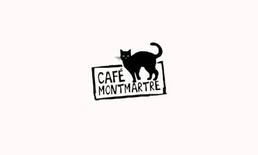
Café Montmartre is a French cuisine restaurant based in Lithuania which has cleverly filled its logo with iconic Parisian imagery.
Le Chat Noir (the black cat) was the first and most famous Parisian cabaret, and Montmartre (also translates to La Butte, meaning small hill) is the district of Paris where it was located.
Although there’s no direct connection to a restaurant, borrowing these external influences, their logo says all it needs to about who they are, what they believe in, and what they provide.
A great example of how you can make your logo genuinely unique by playing around with an image, names, and fonts that have a reference to your business.
Construction Logos
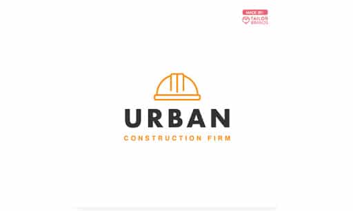
Notice anything about this one?
Yes, same logotype and same colours as the previous , just reversed.
The black on white combination is also symbolic of the fashion industry, and yet this construction company has taken it, and again, made it their own.
So, how did they do it?
Look at the hat; it’s pure Art Nouveau – an international style of architecture, art, and applied art synonymous with excellent design and structure.
By using this influence and conjoining it with colours connected to fashion, Urban construction has created a logo that tells you exactly who they are, sends subliminal messages of high quality, and resonates with anyone living in urban society.
A simple and memorable logo.
Fitness Logos
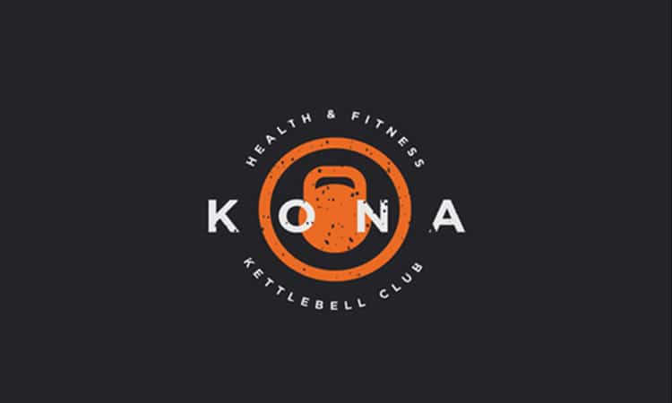
Kona kettle ball club, based in Kailua-Kona, Hawaii, uses a combination logotype (Name, Icon, Wordmark), and it’s an excellent example of how to use different styles while maintaining simplicity.
Let’s first look at the font. They’ve used the same one for their name and description but created a visual impact by using different weights. The font also has an almost military feeling to it, which connects to the service they provide, fitness.
The use of white on black is as classic as Audrey Hepburn in Roman Holiday (have I referenced too far back for you?) Several leading Italian fashion brands use this combination, and Kona fitness has taken it and made it their own by adding orange.
Orange combines the joy of yellow and the energy of red; it represents stimulation, enthusiasm, success, encouragement, determination. And is associated with sunshine and the tropics.
This logo shows us how you can mix a combination of styles and create the perfect cocktail.
Photography Logos
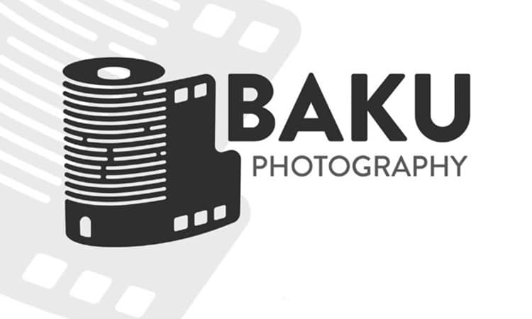
Now an example of how you can use cleverly designed images to send subliminal messages and get the viewer thinking.
Designer Mehman Mmammedov has provided us with a brilliant example of how to combine two iconic industry symbols into one visually engaging image.
At first sight, your eyes are drawn to the role of Analog film, or is it a modern city building? No wait – I can see the leaning tower of Pizza! Whatever you see is subjective; what’s not is the fact that we’re looking at it.
Once your brain has decided on what it thinks it sees, your eyes drift to the name, big and bold, but also simplistic. By the time you’ve finished looking, this logo has dug itself deep into your memory and connected on numerous subliminal levels.
And all of that with only two colours, simple fonts, and an image.
It’s an exceptional logo and a great example of how to create a memorable one.
Real Estate Logos
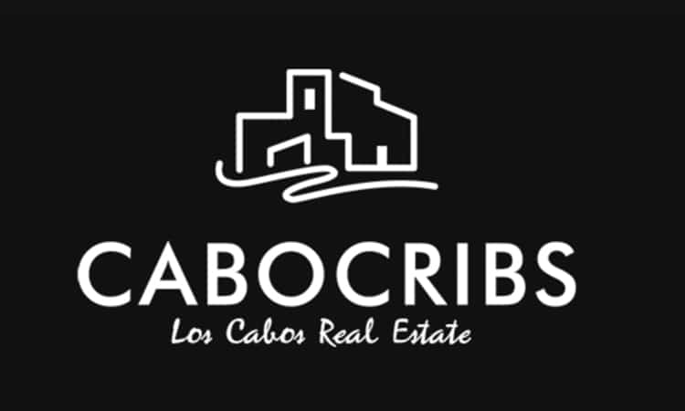
Cabocribs may be selling real estate and using a slang term for a property (crib), but their logo gives an impression of high class and quality.
This one’s a real mix of styles, and by keeping them simple, they’ve managed to bring formal and informal together in a harmonious way.
Colour: White on black, associated with high-quality fashion.
Fonts: Two completely opposing styles. For their name, they stay with a style that’s similar to most French fashion house fonts. For the slogan, they’ve gone with one that’s more laid back, I can see the hammock and hear the sea!
Icon: Again, a brave choice. By combining a classic architecturally driven image with a flowing line (there’s the sea again!), Cabocribs manage to ensure their logo speaks to a broader property buying demographic.
Tech Start-up Logos
Does this one resonate with you too? If it does, then 10 out of 10 to the designer.
Soundcloud is a Berlin-based (home of the party culture and legendary nightlife scene) company that promotes and enables users to upload and stream audio content.
This logo is a stroke of combination genius because it visually hits you on so many levels.
Their name is simple and robust, the cloud, of course, represents a cloud-based server platform, and the increasing and decreasing lines the pulse of a music track.
If you read this post to find inspiration and to learn how to draw upon and use influences from both inside and outside your industry, then look no further than this highly original, emotion grabbing, subconscious connecting, all reverberating logo.
Pure genius.